
Blueprint
Analysing and redesigning a design system generator to surface its core value
About Blueprint
Role and scope
I built and shipped the MVP as the sole designer and developer. V2 addressed the problem identified in V1, and I led the revamp end to end: research, designing the experience, and building it.
Claude was hired as the assistant.
End product
Website, Web App
Timeline
June - July 2026
I shipped v1 and audited it
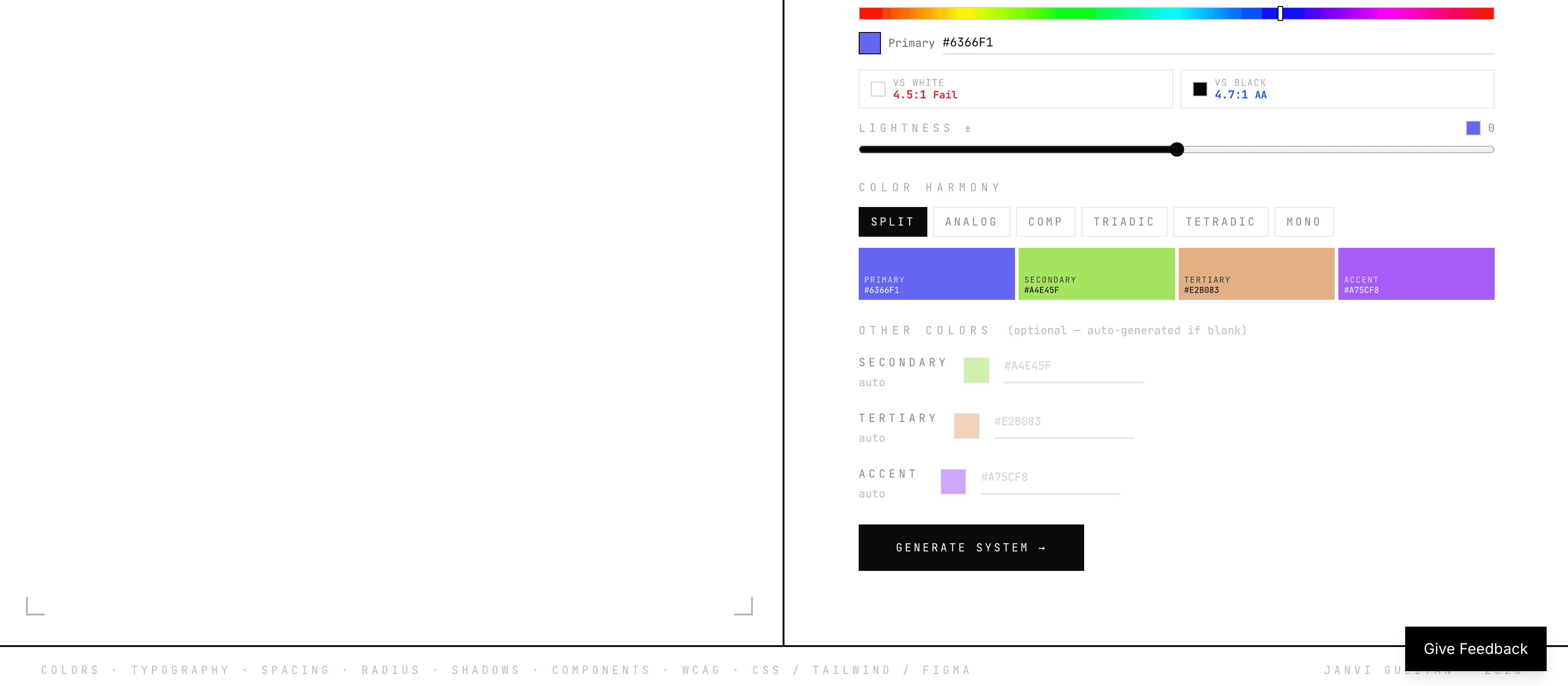
V1 produced a full design system kit from colours to components, exportable to Figma. The problem was that the core of the product sat behind a colour-first order and a technical vocabulary.



Then I tracked its performance for 16 days
Early feedback was split: people said it was good, but others hit real walls. Praise plus friction was a signal that something worked but wasn't landing. So I added analytics to find out where.
After 16 days of data across 95+ users and 180+ sessions, I found:
68%
left without trying the product
3.4%
reached export
What I observed in the session recordings

Users spent their time tuning colours

The Customize panel was almost never found
Export is the core of the product, it's where the whole kit lands in the Figma file and only 3.4% of users reached it.
Want to see the solution first?

I analysed other tools to see where Blueprint fits
I looked at the design system tools in the space. None of them gave designers the building blocks in Figma, they were either built for code and AI workflows, or for maintaining a design system that already exists.

And pinned down who'd actually use it
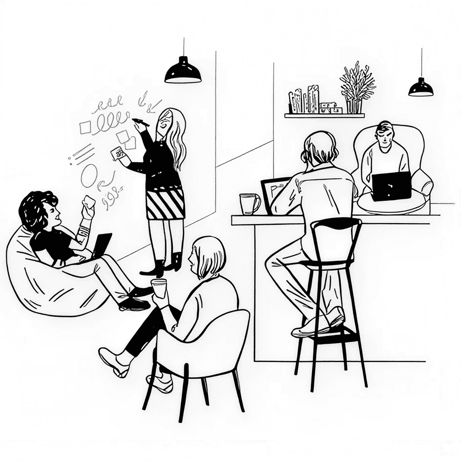
Blueprint is built for people who rebuild the same foundations every project, freelancers and studios doing client work. I've worked both as a freelancer and in a studio, and this was my own kickoff grind before it was a product.

Freelancers
Design Studios
What users told me
I put Blueprint in front of a few students using it for their internship work. Three things came up:
The language was written for technical users, words like tokens, semantic and WCAG.
They wanted more control over what gets exported.
The Figma export runs through a console script, steps-heavy, unfamiliar to many designers.
I prioritised and reframed the problem
People were using the product for what it wasn't, and never finding what it could do. The core offering wasn't missing but it was hidden behind the wrong words and the wrong order. That needed a revamp: rethinking the flows, the UI and the whole experience, so people could see what Blueprint actually offers.
How might we make Blueprint's core offering visible from the first screen, so users understand what they're getting before they decide to leave?
Then I explored different directions
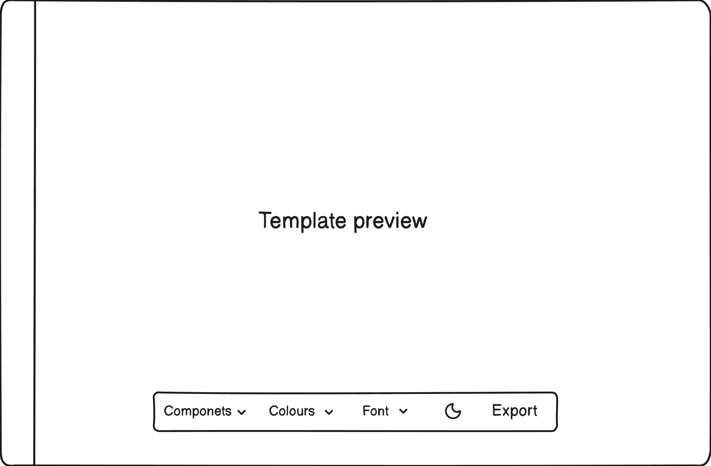
The result page needed to make the product feel like a starter design system kit, something users customise into their own, not a palette tool. I explored a few directions, some leading with components and others with templates:



I redesigned the whole experience
Blueprint is built for people who rebuild the same foundations every project, freelancers and studios doing client work. I've worked both as a freelancer and in a studio, and this was my own kickoff grind before it was a product.

Landing page with one clear path
Solves for problem:
V1 opened with two inputs and a colour picker, which read as a palette tool and raised cognitive load from the start.
Now one CTA and a clear line on what the product is removes the first decision and stops the misread.
Onboarding that builds a system
Solves for problem:
V1 took only a colour, which reinforced the palette-tool read.
Onboarding now collects colours, fonts and roundness, then asks for a name, each step makes the output feel like the user's own design system rather than a generated swatch set.
Components shown first
Solves for problem:
V1's result page opened on colours, burying the core of the product further down.
The result page now lands on components, making the core discoverable from the start.

Editing by clicking the component
Solves for problem:
V1 buried the customize controls,
Now clicking a component opens its editor, making customisation visible from the start.
Foundations that update everything
Changing a colour or font updates every component using it. This builds a connected system so the experience holds together both in the tool and after the Figma handoff.
Templates that show the real system
Solves for problem:
V1's templates were recoloured mockups with no real components.
Templates now show the user's actual system applied in the template, helping them visualise what they've built.

A guided export
Solves for problem:
Few V1's export failed users at handoff: the "can't paste into Figma" feedback.
Export now walks through numbered steps for anyone stuck.
And improved the Figma output users landed with
The handoff file
The export opens with a cover page carrying the design system's name, so the file reads as the user's own system rather than a generic export.

Foundations is reusable
There's a foundation overview page and an icon library the user can extend.
Colours, typography and spacing are exported as variables and styles. These tokens are used in the components.
Components connected to foundation
Every component is exported in all its versions including different sizes and states.
Each are connected to the colours and fonts from the foundation, so if the user changes a colour later, every component using it updates automatically.
I measured the impact over the first 6 weeks
I monitored the journey from landing on the product to exporting to Figma, for V1 across 11 weeks and V2 across the first 6 weeks after launch.
4.7x
increase in end-to-end conversion
End-to-end conversion rose from 0.98% to 4.64%, with 15 users completing the journey against 2 before, across a much shorter window.

The revamp changed the path users took through the product. By putting the system itself at the centre of the experience, simplifying the entry point, making customisation visible, and turning export into a guided flow, more users moved through the product instead of stopping before they reached the core value.
Where I'm taking it next
V2 is now live, and I'm still collecting data to see which problems surface next, where people drop between landing, generating and exporting. Beyond what the new data surfaces, V3 is planned to:
Build a Figma plugin to smoothen the export and make it work in browser Figma too.
Optimise the component editing experience.
Keep adding components to the library, a continuous effort.
My learnings
Prioritising is the job
One problem made of many problems. The work wasn't solving all of them, it was picking which one this version had to answer, and being able to say why the rest could wait.
Products don't finish, they compound
I got a real look at how a product keeps growing and improving rather than arriving.
Build, get feedback, iterate
The revamp exists because people told me it was good and told me it was broken.






Checkpoint Reached
Let’s build something meaningful!
© Janvi Guliyan 2026
Made with love