Enter password to view case study
Amaron Assist
Amaron Assist: designing an editor that lets the team update the landing page without a developer

About Amaron Assist
My Role
UX Designer (Intern)
Team
1 PM, 1 Senior Designer
Timeline
~ 2 weeks
A problem we caught before it surfaced
The Amaron Assist landing page was new, so this hadn't surfaced yet, but it was foreseeable: every future change (copy, offers, services) would lead to briefing the development team and scheduling for a sprint. The brief I received was to prevent that and hand control to an internal admin with a tool to edit page content, preview it, and manage SEO, without pulling in developers each time.
Want to see the solution first?
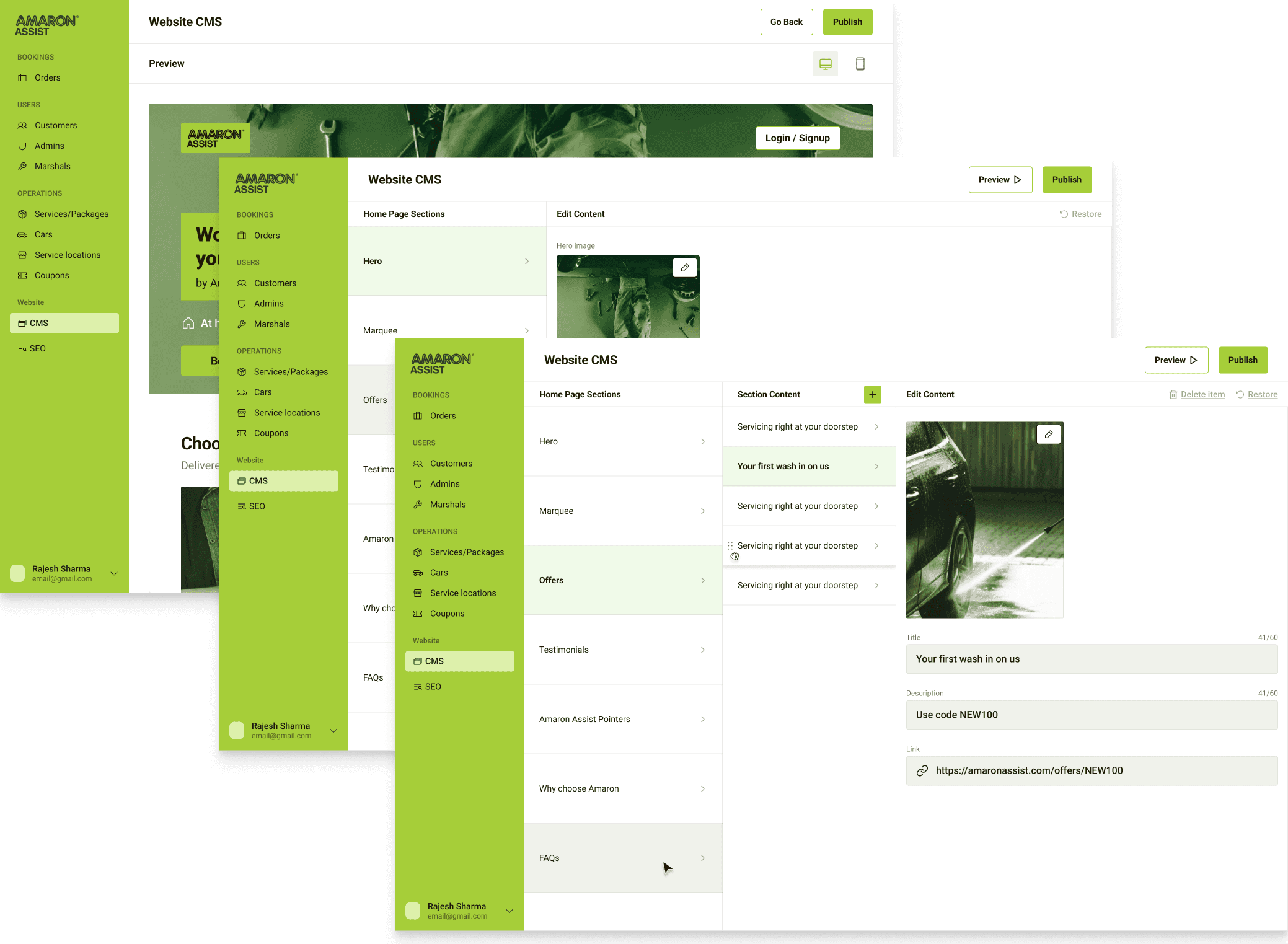
I pinned down who'd actually use it
The user is likely someone on the marketing or sales team who's short on time. No one was specified in the brief, so I worked that out from the content on the landing page.

The Amaron Assist's team
Why the landing page needs regular updating
The service is new
Amaron Assist launched recently and is still growing, so the page doesn't stay the same for long.
Offers don't last
A new offer goes up, an old one ends, and the prices and dates attached to them change too.
New services get added
As Amaron Assist starts covering more, those services need to show up on the page.
It's the first thing a customer sees
People read this page before they book, so anything wrong on it is something they'll act on.
I studied similar tools to see how they tackled the problem
The PM and senior designer pointed me to which tools were worth looking at. I did the analysis to understand how current tools handle content editing before I started designing and drew out what mattered for this project. I looked at tools like WordPress, Framer and Webflow.


Learning from existing tools
Content can be filled in like a form
Changes previewed before publishing
The editor never touches the design
Built for websites with 1+ pages, has a lot of settings
Has a learning curve
Restoring a previous version can be a lot of work
Then I analysed the sections and categorised them
I went through the landing page section by section to review what content was present and identify what would need to be modified. Two types of content emerged.
Static section
Text and images can be edited, but no new content can be added or removed entirely.
Expandable section
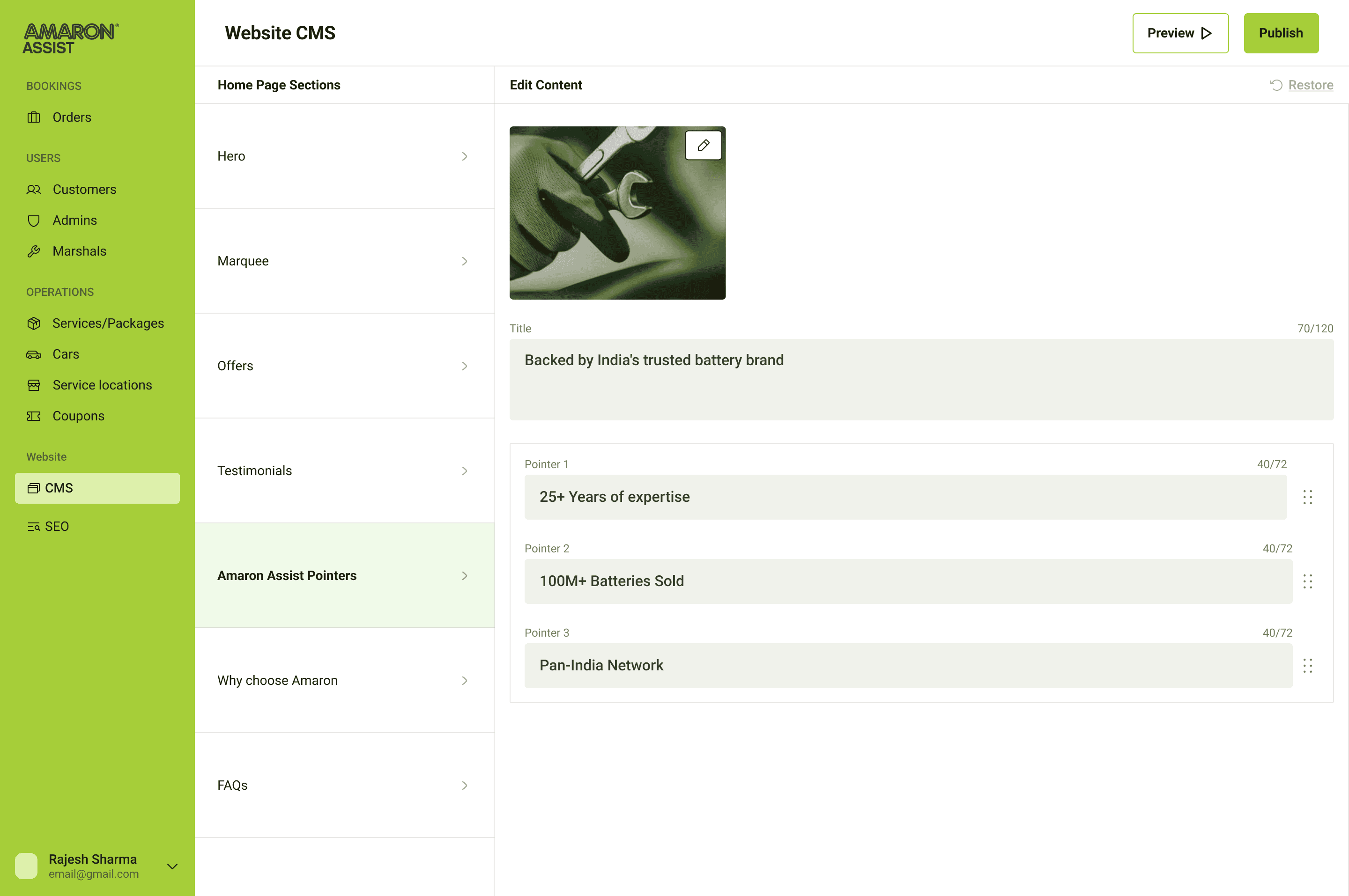
Existing entries can be edited, and entries of the same type can be added or removed as the business changes.


Static sections from the Amaron Assist's landing page


Expandable sections from the Amaron Assist's landing page
This meant the interface only ever had two jobs: edit a field, or add and remove an entry. Any section that didn't fall into either type was left uneditable.
We prioritised and reframed the problem
Given the two-week scope, there was no room for full UX research. I listed the jobs from the brief, the tool analysis, and the page breakdown, then prioritised them by need, with the PM and senior designer's input on what mattered for this phase.

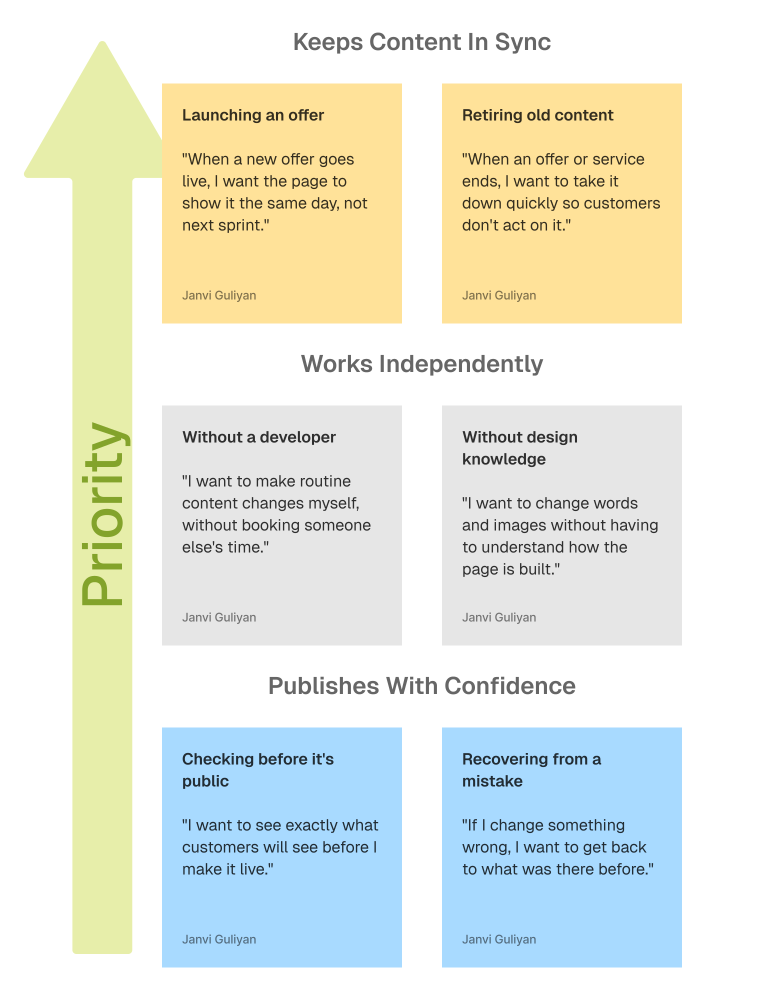
How might we give a non-technical team member full control of the landing page's content without giving them control of its design?
Then I explored different directions
I tried three layouts. Each answered the same two things differently: where the editing happens, and how much of the page the editor can see while doing it. None of them worked as a whole, but each had a part I used for the final solution.


I designed the landing page editor
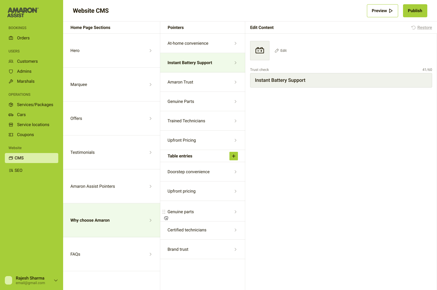
I took a part of each iteration into the final layout. I moved preview out of the editing view and made it its own step, so the editor can see the whole page the way a customer would instead of one section at a time. I kept the three-column layout from iteration 3, but only for the sections where entries get added and removed. Content-only sections skip it and go straight to their fields.
Static sections
The screens shows how the static sections are edited. The editing column directly contains the fields to be editied in the selected section.
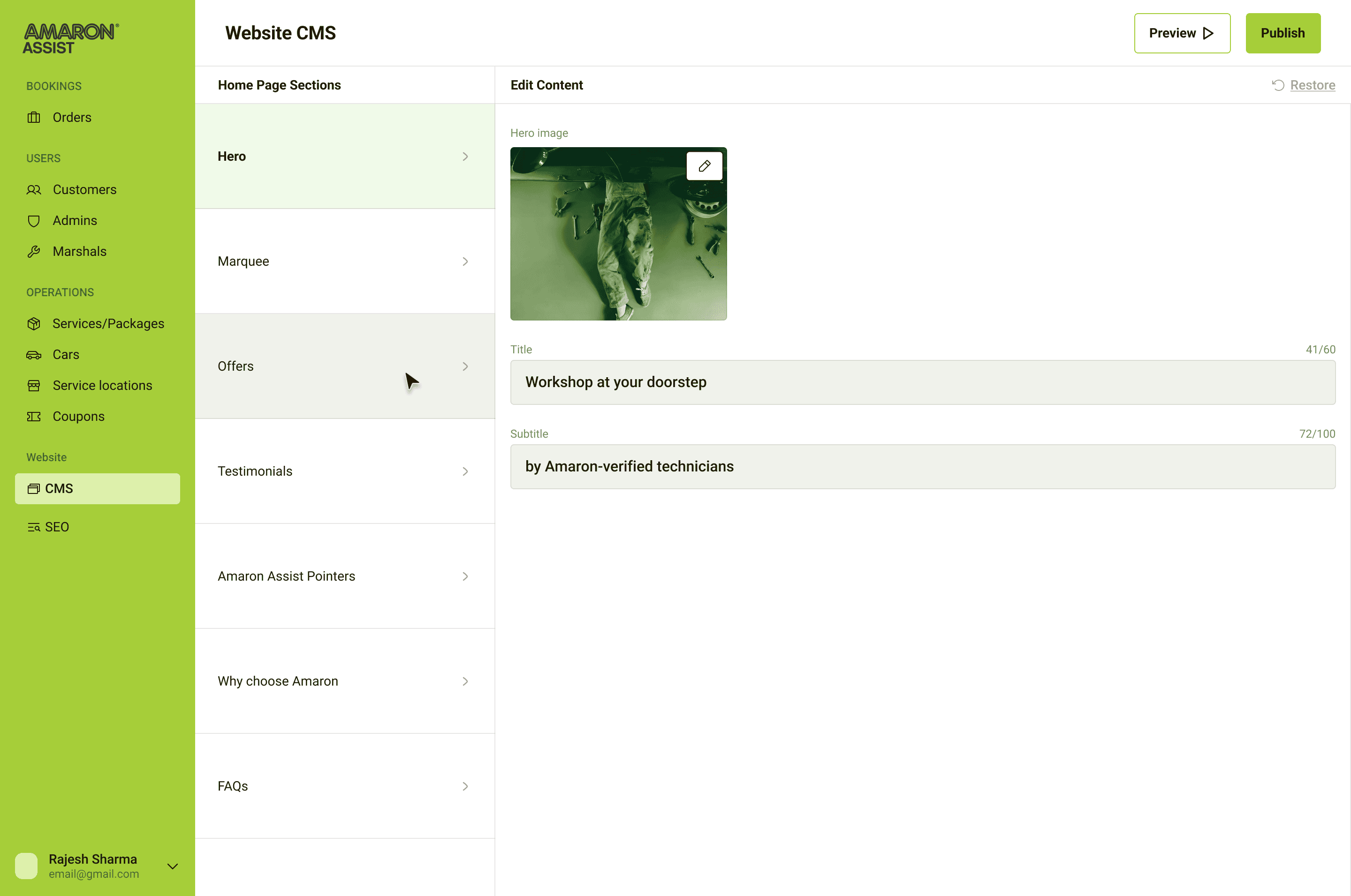
Restore
Unpublished changes can be put back to what was last published, so a change the editor isn't sure about never has to reach the live page.

Adding an entry
Expandable sections get a third column listing their entries. New ones can be added until the section reaches its maximum, at which point the add button is disabled.

Deleting an entry
Entries can be removed from expandable sections, with deletion turned off where a section shouldn't be emptied.

Testimonials
An expandable section with an order ID field on each entry, visible only to the admin, so a testimonial can be traced back to a real order.

Mixed sections
Some sections hold both kinds of content. In the comparison table, the copy around it is fixed while the rows can be added and removed. Each row is marked against two columns, and marking a cross asks for a short reason.

Preview
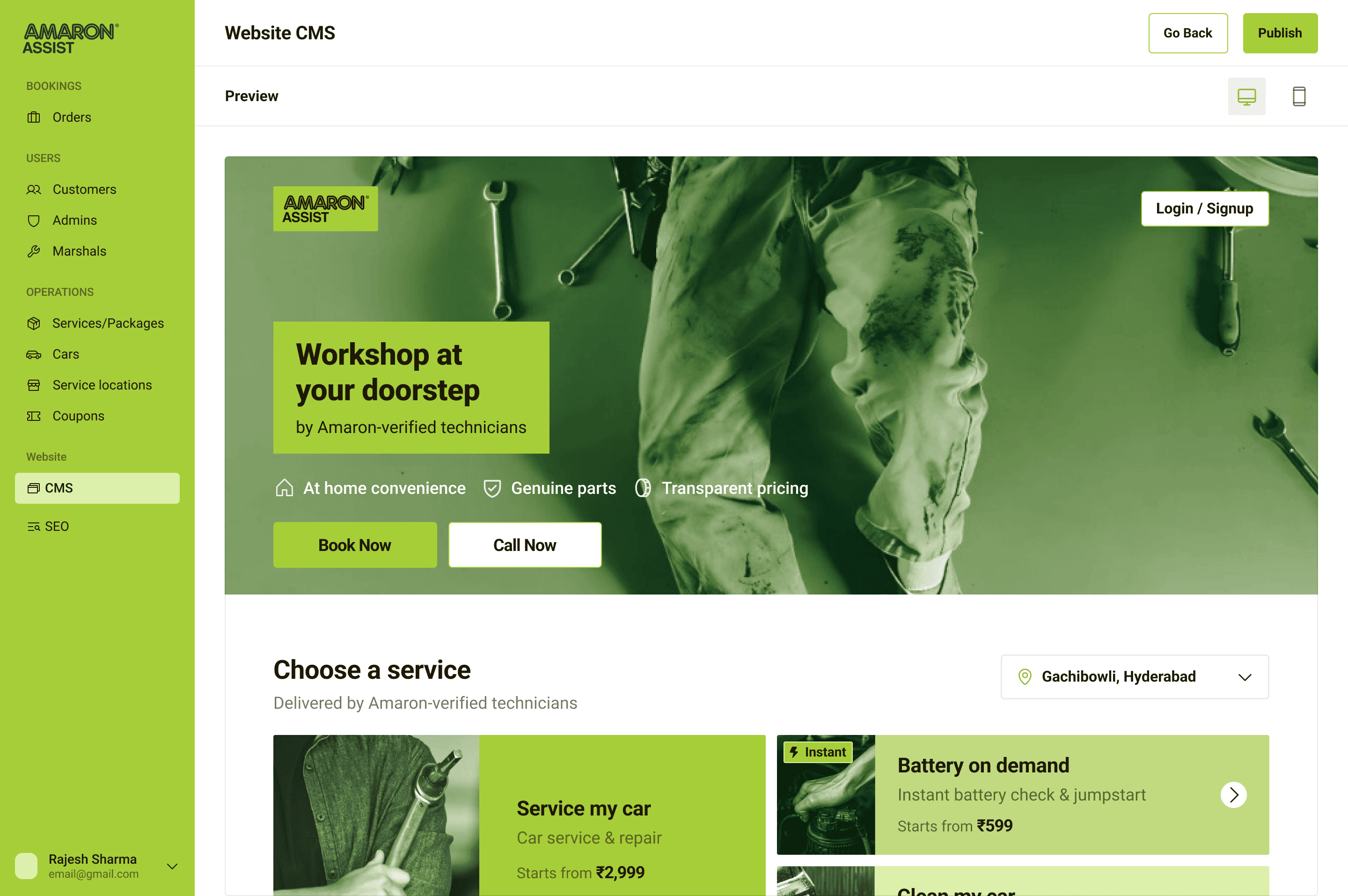
The full page as a customer would see it, on desktop and mobile, before anything is published.

SEO
Site settings and social sharing, kept in their own tab.


What shipped and what didn't
The design was completed and handed off for development.
Additionally, one feature was designed and then cut. I built a version that pulled testimonials from the backend so each one could be tied to a real order instead of being typed in by hand. It was dropped for this phase because the simpler manual version was enough to launch with. What stayed from it is an order ID field on each testimonial, visible only to the admin, so a testimonial can still be traced back to an order. The backend version is left for a later phase.
My learnings
Building on top of an existing solution.
I learnt how products add new features to what already exists, and how a new feature has to adapt to the current product, in terms of layout, patterns, and the design system it sits inside.
Edge cases add depth.
I realised that as we accounted for edge cases, the solution felt more rounded and more focused on what the user actually needed. Thinking about the problems that could occur indirectly led to a better thought-out solution.






Checkpoint Reached
Let’s build something meaningful!
© Janvi Guliyan 2026
Made with love