Designing A Faster Way To Create Ads
Introduction
Advertisements and social media marketing are important for any company as they boost visibility and attract users’ attention to key product features, appealing to their needs.
But what about the time consumed to make those ads and posts?
Creating an ad concept, from initial brainstorming to final production, takes anywhere between a few hours to several days, depending on the complexity.
Duration: 3–4 months
Role: UX/UI Designer
Collaborated with: Founder, Engineering Team
Scope: User flows, UI/UX Design, Video

Zappit AI’s dashboard allows users to create an ad storyboard in minutes, streamlining everything from brainstorming to finding inspiration through posts by other brands.
It’s built around three key user needs:
Create AI-assisted ad storyboards quickly
View social media posts and ads across all platforms, including their own and competitors’
Get actionable insights on any post or ad
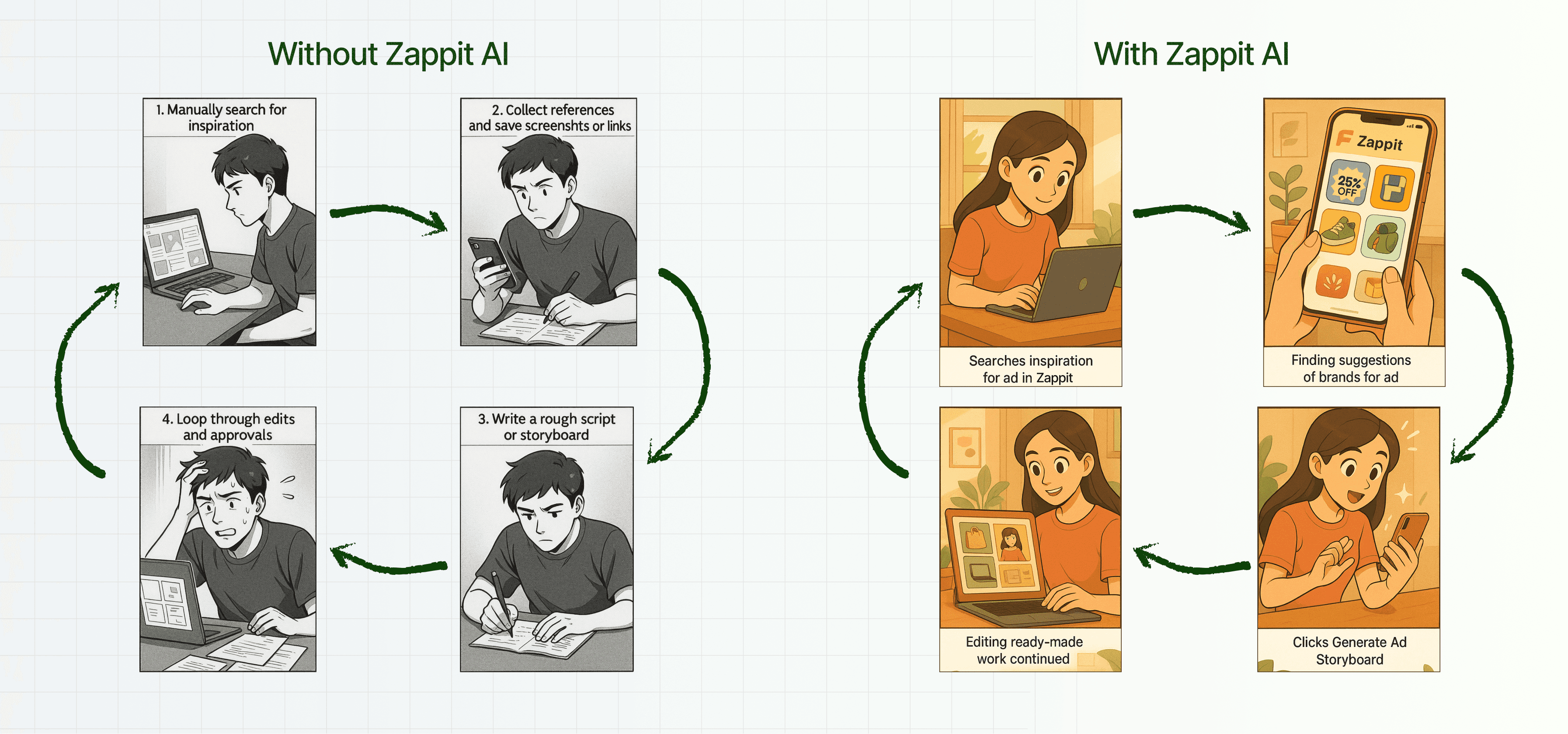
Together, these features help users gather inspiration and turn it into ad storyboards ready for production after a few edits, if needed, ultimately reducing the ad creation process from hours or days to just minutes.
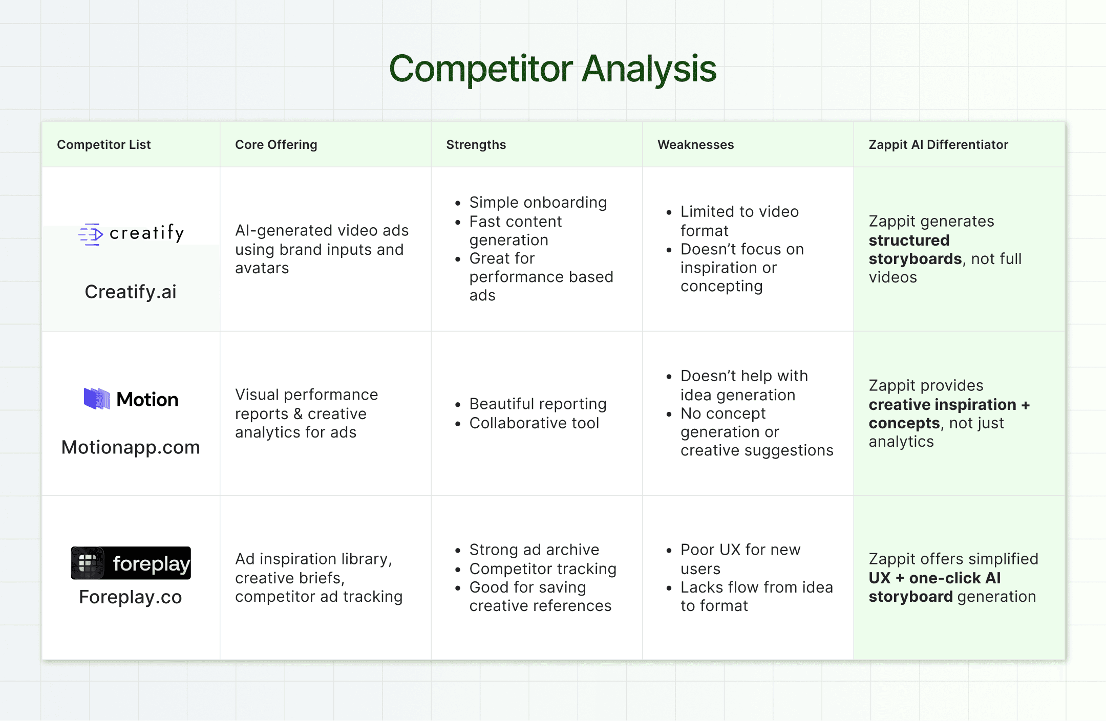
I thoroughly researched similar products to understand how they approach ad creation. I analyzed their user flows, key features, and limitations in comparison to what Zappit aims to offer. My findings are summarized in the table below.
To define the information architecture and overall flow of the application, I focused on two key principles:
Make each screen actionable: Users should instantly understand what they can do on a screen at a glance.
Minimize cognitive load: Fewer decisions = better retention. I reduced the number of clicks wherever possible, without sacrificing clarity or control.
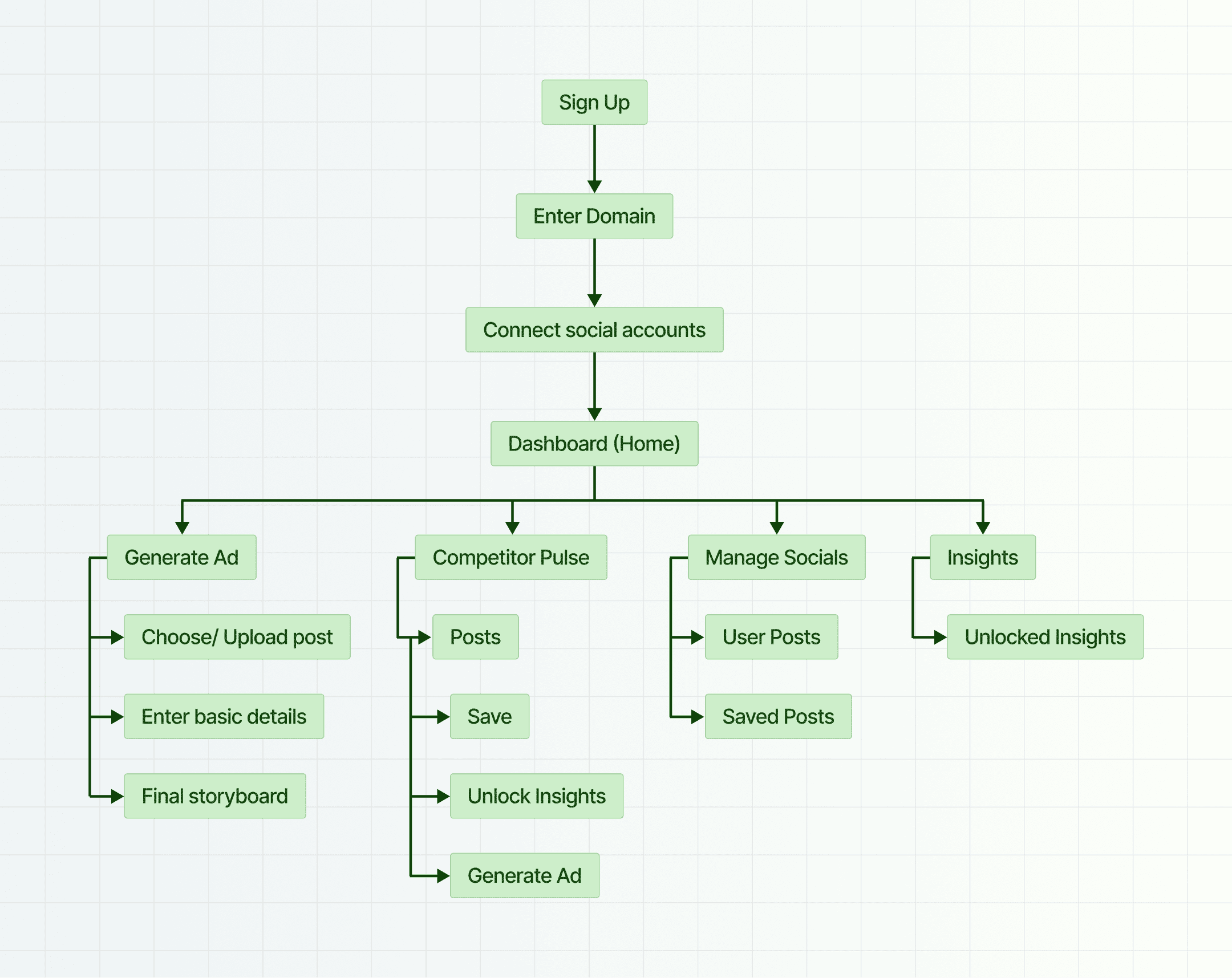
Below is the information architecture I designed to map the flow clearly before jumping into wireframes.
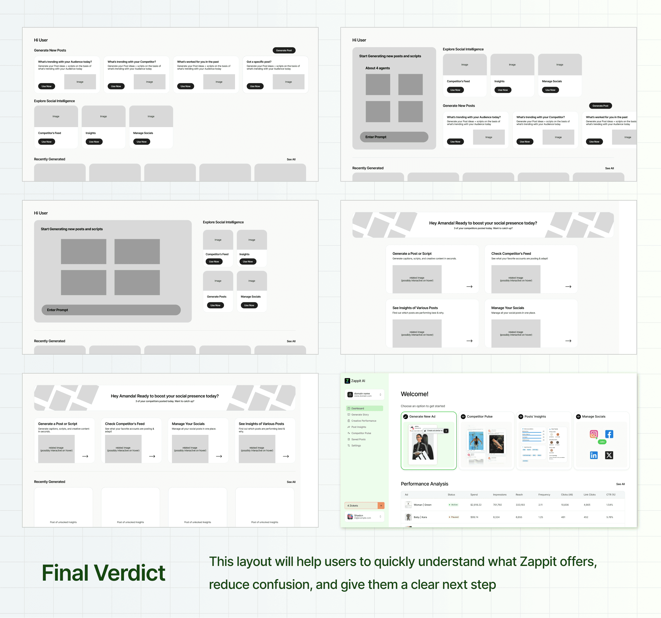
For the dashboard landing page, I sketched multiple wireframes to identify which layout would work best. I was looking for something that:
Clearly shows what Zappit is about
Encourages users to explore more
Makes it obvious what to do next
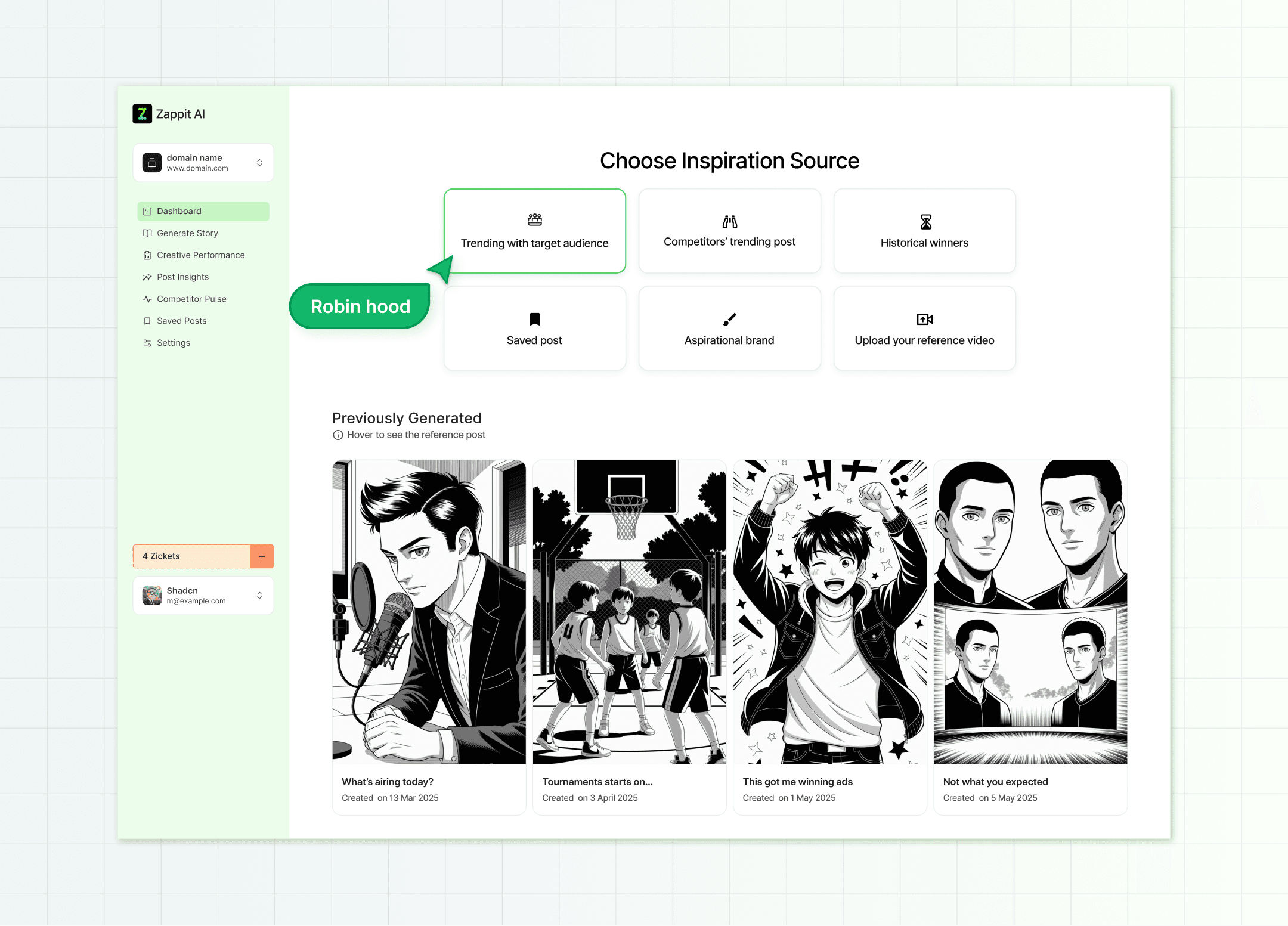
Generating an Ad Storyboard
Optimizing the generated storyboard flow was key to lowering cognitive load and also making sure the control of the flow remained with the users. We built a custom flow where users could pick a post and quickly generate a storyboard from it, keeping things smooth and simple.
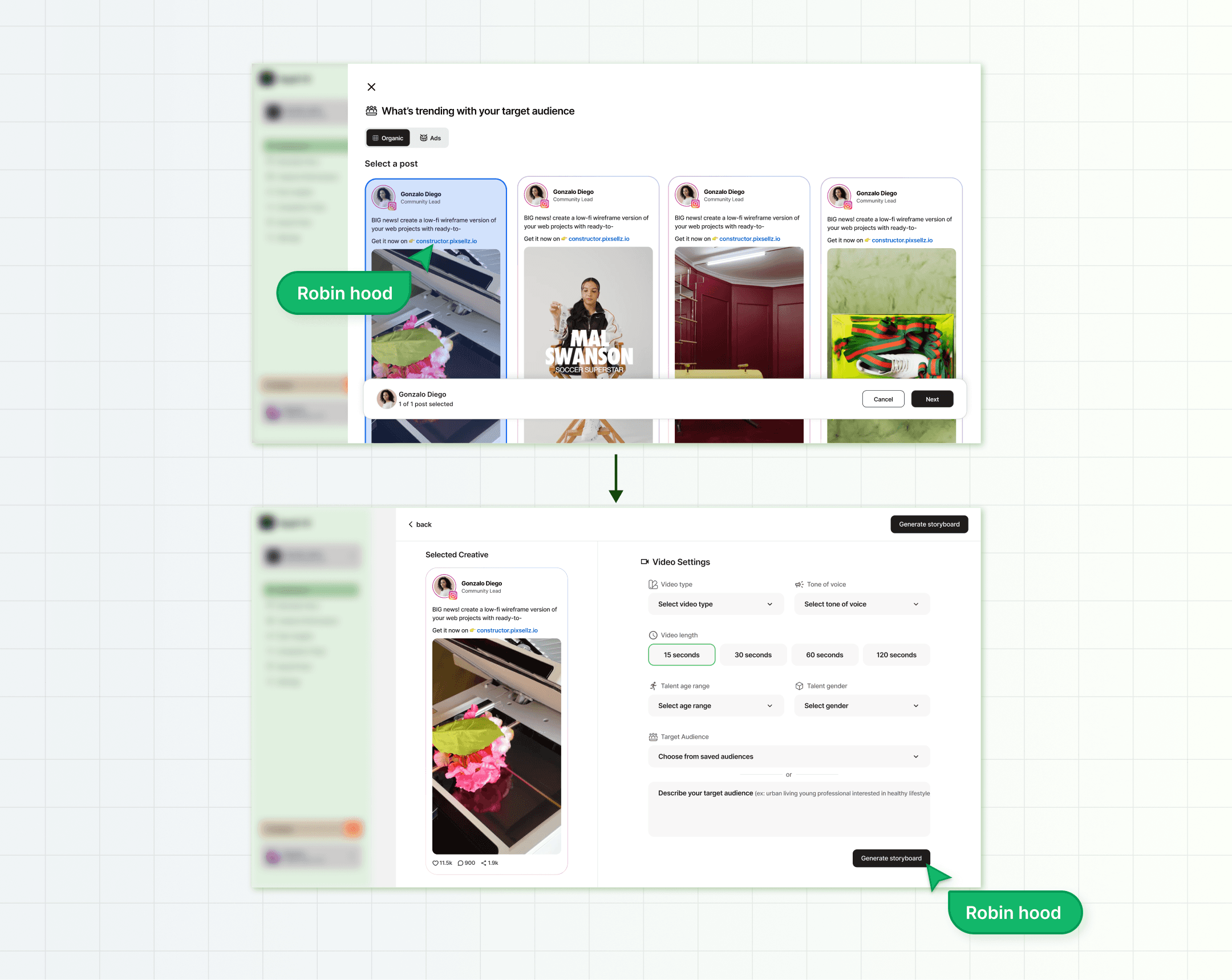
Hover to Preview Interaction
We noticed a usability gap early on
Users had no way of knowing what the original inspiration post was once they generated a storyboard.
To fix this, I proposed a “hover to preview” interaction that revealed the source post.
I was inspired by YouTube’s video hover previews. It felt natural to bring a similar micro-interaction here to increase clarity without adding visual clutter.
It’s a small detail, but it adds a layer of transparency and reduces user confusion when switching between storyboards.

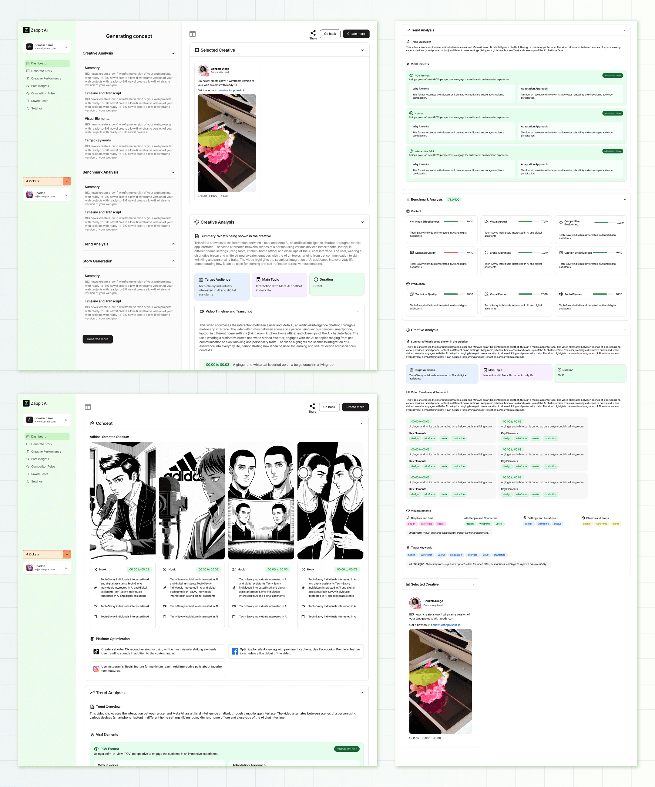
What’s Happening Behind the Scenes
Since generating a storyboard takes a few minutes, me and the team decided to show a step-by-step process instead of a boring loading screen.
We wanted to show what the AI was doing, from analyzing the content of the inspired post to what’s trending, and finally creating the storyboard. This helped build trust and gave the whole process a bit more meaning.
This helps build trust and gives users visibility into what is happening behind the scenes, instead of just a spinning loader.
Additionally, users could revisit incomplete storyboards while they were being generated, keeping the flow flexible
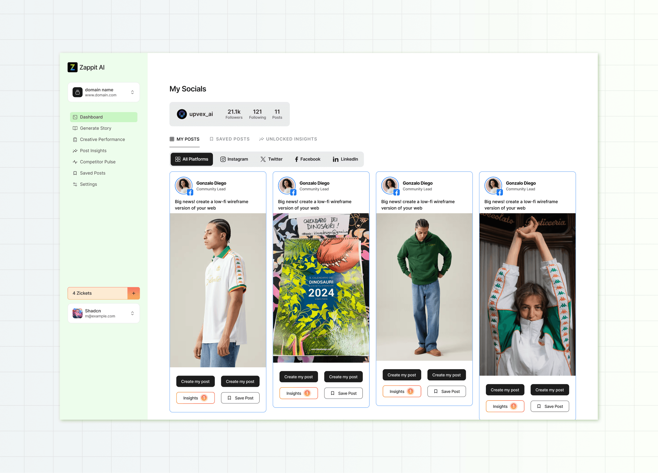
All-in-One Feed & Insights
During early user flow discussions, we identified a key need: users often look for inspiration from other brands before creating an ad. To support this, we designed a consolidated feed that brings in posts and ads from competitors and aspirational brands across platforms.
My focus while designing this section was:
Clearly showing who posted what, and where
Keeping interactions lightweight, users can view insights, save posts, or generate an ad from any post
This cuts down the time users usually spend switching tabs or researching manually, and makes the jump from inspiration to action more seamless.

This screen acts as a content hub where users can access all their posts, saved ideas, and unlocked inspirations across platforms, without jumping between tools.
This centralization helps reduce workflow friction and makes tracking content easier, especially for teams handling multiple platforms.
To communicate the product effectively, I created a short walkthrough video showcasing all the key features. This will be placed on the landing page so visitors can quickly understand what Zappit does and how it works.
This project taught me a lot, not just about designing better flows, but about thinking holistically.
Key takeaways
Focus on making flows actionable and as simple as possible
Start with the core problem, then account for edge cases to avoid friction later
It was a high-impact project, both for me as a designer and potentially for the teams who’ll use Zappit.
Once adopted, it could significantly reduce the time spent on ad creation, turning a process that used to take hours or days into something done in minutes.
Other works


Checkpoint Reached
Let’s build something next.
Designed & built by Janvi Guliyan.